Correlation in Statistics
CORRELATION DEFINITIONS
Correlation means two quantitative facts having the relationship of cause and effect varying simultaneously in the same or in the opposite directions, the measurement of such variations.
Correlation definition according to L.R.Conner "If two or more quantities vary in sympathy so that movements in the one tend to be accompanied by corresponding movements in the other, then they are said to be correlated".
Correlation definition according to King "Correlation means that between two series or groups of data, there exists some casual connections".
Correlation definition according to Croxton and Cowden "When the relationship is of a quantitative nature, the appropriate statistical tool for discovering and measuring the relationship and expressing it in a brief formula is known as correlation".
Correlation definition according to W.A.Neiswanger "Correlation analysis contributes to the understanding of economic behavior, aids in locating critically important variables on which others depend may reveal to the economist the connections by which disturbances spread and suggest to him the paths through which stabilizing forces many become effective".
Correlation is a statistical concept that measures the degree to which two variables are related or associated with each other. It quantifies the strength and direction of the relationship between two or more variables, helping to understand how changes in one variable may be associated with changes in another.
Key points about correlation include:
Strength of Relationship: Correlation indicates how strong the relationship between variables is. It can range from -1 to 1, with -1 indicating a perfect negative correlation (as one variable increases, the other decreases), 1 indicating a perfect positive correlation (both variables increase together), and 0 indicating no correlation (no apparent relationship).
Direction of Relationship: Correlation also provides information about the direction of the relationship. Positive correlation means that as one variable increases, the other tends to increase as well, while negative correlation implies that as one variable increases, the other tends to decrease.
Scatterplots: Correlation is often visualized using scatterplots, where each data point represents a combination of values for the two variables. A positive correlation appears as a trend where data points cluster in an upward direction, while a negative correlation shows a downward trend.
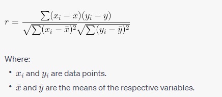
Pearson Correlation Coefficient: The most common method to calculate correlation is the Pearson correlation coefficient (r). It measures linear relationships between variables. It is calculated by dividing the covariance of the two variables by the product of their standard deviations. The formula for the Pearson correlation coefficient is:
Pearson Correlation Coefficient Formula
are the means of the respective variables.
Sensitivity to Outliers: Correlation is sensitive to outliers, which can significantly influence the calculated correlation coefficient. Extreme values in the data can either inflate or deflate the apparent strength of the relationship.
Causation: It's important to note that correlation does not imply causation. Just because two variables are correlated does not mean that one causes the other. There may be underlying factors or third variables affecting both variables simultaneously.
In summary, correlation is a statistical measure used to quantify the relationship between two or more variables, helping researchers and analysts understand the strength and direction of this relationship. It is a valuable tool in various fields, including statistics, economics, social sciences, and many others, for exploring patterns and making predictions.
Perfect Correlation
When the movement in two related variables is in the same direction and in the same proportion, it is a perfect positive correlation. The coefficient of correlation(r) in this case will be +1. On the other hand, if changes are proportional but in the opposite direction, it will be a perfect negative correlation and its calculated value will be -1.
Absence of Correlation
If no independence is found between two variables or there is no relationship between deviation in one variable to corresponding deviations in the other variable, it is the situation of absence of correlation and in this case coefficient of correlation will be zero.
The correlation coefficient is a single-number summary expressing the utility of linear regression. a correlation coefficient is a dimensionless number between - 1 and + 1. The slope and the correlation have the same positive or negative sign. This single number is used to convey the strength of a linear relationship, so values closer to - 1 or + 1 indicate greater fidelity to a straight-line relationship.
The correlation is standardized in the sense that its value does not depend on the means or standard deviations of the x or y values.
If we add or subtract the same values from the data (and thereby change the means ), the correlation remains the same. If we multiply all the xs (or the ys)by some positive value, the correlation remains the same. If we multiply either the xs or the ys by a negative number, the sign of the correlation will reverse.
As with any oversimplification of a complex situation, the correlation coefficient has its benefits, but also its shortcomings. A variety of values of the correlation are illustrated. Each of these separate graphs consists of 50 simulated pairs of observations. A correlation of 0 in the upper left of no indication of a linear relationship between the plotted variables. A correlation of 0.4 does not indicate much strength, and A correlation of either 0.8 or 0.9 indicates a rather strong linear trend.
Importance of correlation
Correlation analysis in Python
Data has been taken from GitHub
| age | sex | bmi | children | smoker | region | charges | |
|---|---|---|---|---|---|---|---|
| 0 | 19 | female | 27.900 | 0 | yes | southwest | 16884.92400 |
| 1 | 18 | male | 33.770 | 1 | no | southeast | 1725.55230 |
| 2 | 28 | male | 33.000 | 3 | no | southeast | 4449.46200 |
| 3 | 33 | male | 22.705 | 0 | no | northwest | 21984.47061 |
| 4 | 32 | male | 28.880 | 0 | no | northwest | 3866.85520 |
| ... | ... | ... | ... | ... | ... | ... | ... |
| 1333 | 50 | male | 30.970 | 3 | no | northwest | 10600.54830 |
| 1334 | 18 | female | 31.920 | 0 | no | northeast | 2205.98080 |
| 1335 | 18 | female | 36.850 | 0 | no | southeast | 1629.83350 |
| 1336 | 21 | female | 25.800 | 0 | no | southwest | 2007.94500 |
| 1337 | 61 | female | 29.070 | 0 | yes | northwest | 29141.36030 |
1338 rows × 7 columns
| age | bmi | children | charges | |
|---|---|---|---|---|
| count | 1338.000000 | 1338.000000 | 1338.000000 | 1338.000000 |
| mean | 39.207025 | 30.663397 | 1.094918 | 13270.422265 |
| std | 14.049960 | 6.098187 | 1.205493 | 12110.011237 |
| min | 18.000000 | 15.960000 | 0.000000 | 1121.873900 |
| 25% | 27.000000 | 26.296250 | 0.000000 | 4740.287150 |
| 50% | 39.000000 | 30.400000 | 1.000000 | 9382.033000 |
| 75% | 51.000000 | 34.693750 | 2.000000 | 16639.912515 |
| max | 64.000000 | 53.130000 | 5.000000 | 63770.428010 |
Machine learning book
#Correlation
Statistics book in Python
| age | bmi | children | charges | |
|---|---|---|---|---|
| age | 1.000000 | 0.109272 | 0.042469 | 0.299008 |
| bmi | 0.109272 | 1.000000 | 0.012759 | 0.198341 |
| children | 0.042469 | 0.012759 | 1.000000 | 0.067998 |
| charges | 0.299008 | 0.198341 | 0.067998 | 1.000000 |


0 Comments